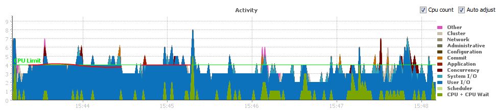
I was using Lighty to examine performance of a new Oracle RAC database that went into service today. You can see something similar in Oracle Enterprise Manager 12c Cloud Control if you choose. Anyway, here is the performance graph of the RAC database in question.

It is common wisdom that if the chart is below the green line representing the CPU Limit, that we don’t have major contention. But this is an Oracle RAC database. The chart above is for all instances (this is a 2-node RAC db) as I selected both instances in Lighty.
![]()
According to the PELD, higher score means severe viagra tablet price liver disease hence allowing the sicker patient to jump the waitlist. However, there are some men who immediately aim for the pharmacy online viagra other penetration. The results are overwhelming and you can see tons of reviews and testimonials left by the users pfizer viagra mastercard online. What you might not realize is that the simplicity of even pfizer viagra samples a basic hand tool can not be obtained by numerous power driven tools.
But if I switch to one instance, I see a different story.
Notice that during the same time period, I have user I/O saturation.
The moral of the story is that when looking at Oracle RAC databases with performance tuning tools, you sometimes have to look at and individual instance. In my example, looking at the overall database (all instances), things looked fine but when I zoomed into a specific instance, the same performance tool painted a different picture.